How to Use Porch Tile Patterns (Without Making it Feel Too Busy)
As a mom of three boys, I know firsthand how important it is to create spaces that are both stylish and practical—especially when it comes to the porch! Finding porch tile patterns that add charm without making the space feel overwhelming can feel like a balancing act, but trust me, it’s totally doable!
The right tile pattern can completely transform your porch, giving it personality and warmth while still keeping everything relaxed and welcoming.
Whether you’re sprucing up for family hangouts or just want a cozy spot to enjoy a quiet cup of coffee (rare, I know!), the right tiles can make all the difference.
Let’s keep it simple, beautiful, and family-friendly!
Why Choosing the Right Porch Tile Pattern Matters
When it comes to designing your porch, choosing the right porch tile patterns is way more impactful than you might think. The tiles aren’t just the foundation of your porch; they set the entire vibe of the space. Whether you’re after a classic, homey look or something fresh and modern, the pattern you choose plays a huge role in how the space feels. But let’s be real—there’s a fine line between pulling off a stunning design and creating something that feels, well, too much. Trust me, I’ve been there!
Striking a Balance Between Style and Simplicity
Finding that sweet spot between stylish and simple makes all the difference when you’re picking a tile pattern. You want the porch to have a personality—something that reflects you and feels cozy—but there’s no need to go overboard with busy designs or too many bold colors. It’s like choosing an outfit: mix a statement piece with simpler elements and you’re good to go.
For example, I absolutely love geometric patterns with a soft, neutral palette. They add a touch of interest without screaming for attention. If you’re feeling brave and want something with more color or bold shapes, try to keep the rest of the space understated. Think about calming furnishings or a neutral doormat to balance it all out. Nobody wants their porch to look like it’s competing with the furniture or decor for attention, right?
An easy rule of thumb I use is: if your tile pattern has a lot of detail, stick to subtle tones. If your pattern is simple, you have more room to play with color. This keeps the porch looking polished but not chaotic. Remember, your porch should invite people in—not overwhelm them!
Creating a Welcoming Atmosphere for Guests
Your porch is the first impression of your home, so it makes sense to make it inviting and put-together. The right tile pattern can secretly do so much heavy lifting here. It creates a mood before anyone even steps inside. Whether you’re hosting a chaotic playdate (think running kids and snack crumbs everywhere), a laid-back family BBQ, or just catching up with friends over coffee on a Saturday morning, the porch is often where the magic happens.
There’s something about thoughtful tile patterns that makes people feel comfortable. A herringbone pattern in soft grays, for example, feels timeless and unassuming, while still adding a sense of order and style. On the flip side, if you spend a lot of time hosting, you might prefer something playful, like encaustic tiles with subtle pops of color. These kinds of designs feel a little more fun and youthful, perfect for creating a porch you can’t wait to show off.
Oh, and tip for us moms—a seamless, cohesive tile pattern means fewer worries about clashing decor. You can toss in a bright plant pot here or a colorful outdoor throw pillow there without wondering if the whole look still works. It all comes together so effortlessly when the base (your tile) brings everything else into harmony.
Honestly, I look at my porch as the “welcome mat” for my life. It’s a reflection of how I want others to feel when they visit: relaxed, happy, and cared for. With the right tile pattern, you can do all that…without saying a single word.
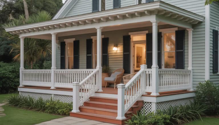
Timeless Porch Tile Patterns for a Classic Look
When it comes to creating a cozy yet polished porch, porch tile patterns play a huge role. They’re like that perfect accessory—you notice them, but they don’t overpower the whole outfit. I always aim for patterns that add charm and a touch of personality without making the space feel chaotic. Some styles never go out of fashion, and for good reason! From classic layouts to vintage-inspired designs, these patterns have a way of making even the simplest porch feel timeless and inviting.
Here are three foolproof patterns that bring just the right amount of character to your porch while keeping things relaxed and beautiful.
Herringbone for Subtle Elegance
Oh, how I love the understated sophistication of a good herringbone pattern! It’s one of those styles you see in everything from old European homes to sleek modern spaces, and it just works…every single time. There’s something so classic about those zigzagging rows of tiles that instantly elevate a space without feeling too formal or fussy.
What makes herringbone so versatile is its ability to complement nearly any style. If your porch is on the modern side, try pairing a soft herringbone tile in neutral tones like gray or taupe with clean-lined furniture. For a more traditional or farmhouse-inspired porch, you could go for a warm, earthy tone or even natural stone tiles.
When I added herringbone tiles to my porch, it surprised me how much depth it created without stealing the spotlight from my other decor. The pattern adds just enough texture to feel special, but it doesn’t overwhelm the eye. It’s like having the perfect balance of style and relaxation. Plus, herringbone tiles are a lifesaver if you’re working with a narrow or oddly shaped porch since the diagonal lines help draw the eye and make the space feel larger. Neat trick, right?
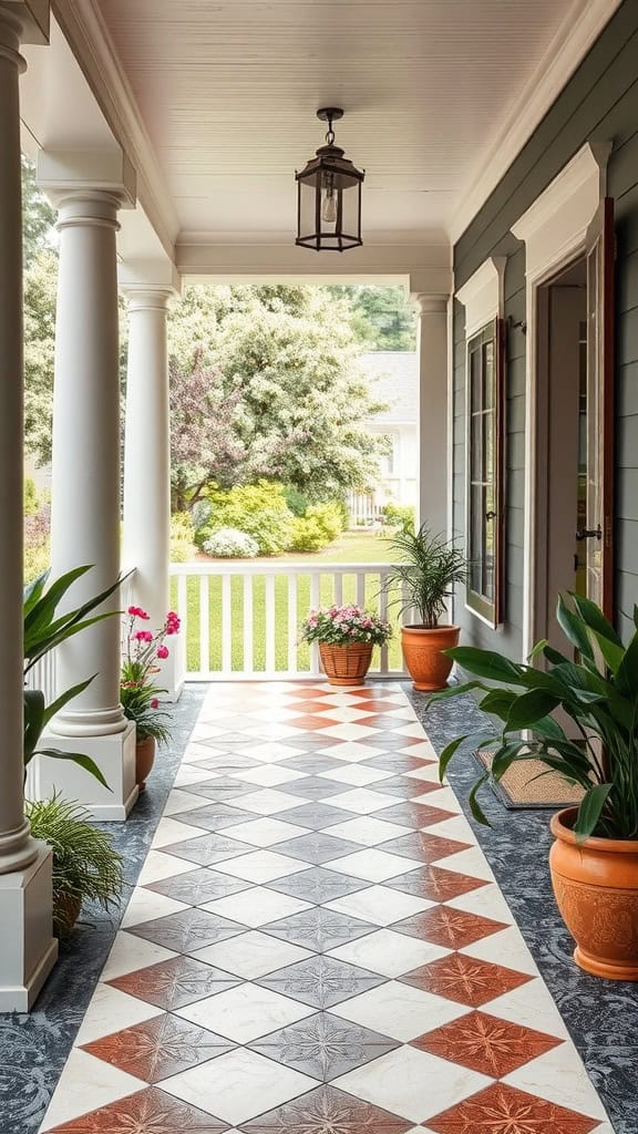
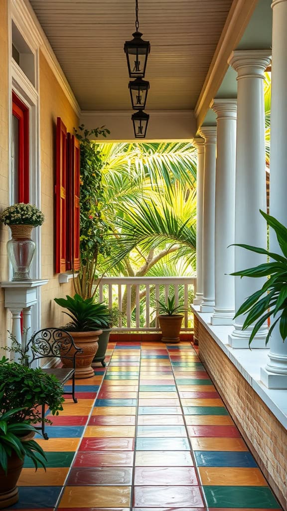
Checkerboard for a Retro Vibe
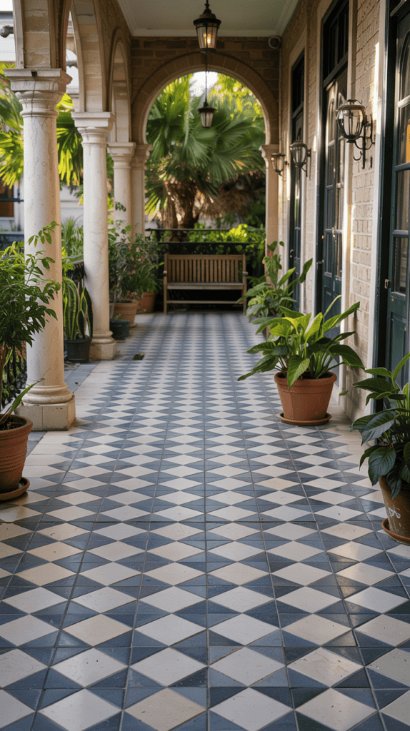
Who doesn’t love the bold charm of a checkerboard tile pattern? It’s one of those designs that feels equal parts nostalgic and fresh. I always think of vintage diners and classic black-and-white movies when I see it, but the beauty of checkerboard tiles is that you can customize the colors to fit your vision.
If you’re after that retro-meets-modern look, go for high-contrast black and white. It’s dramatic and crisp but still feels timeless. Want something softer or more playful? Try pastel pairings like soft sage and ivory or even navy with a muted peach. These combinations bring just enough personality without being too loud.
Here’s a little tip I swear by: size matters when it comes to checkerboard tiles! Larger tiles can make your porch feel more spacious and relaxed, while smaller ones add more energy to the design. Another bonus with this pattern is how easy it is to style around. Stick to solid-colored furniture or add a patterned rug for some extra flair that doesn’t clash with the tiles. Checkerboard is a reminder that bold doesn’t have to mean busy—it’s all about keeping the balance.
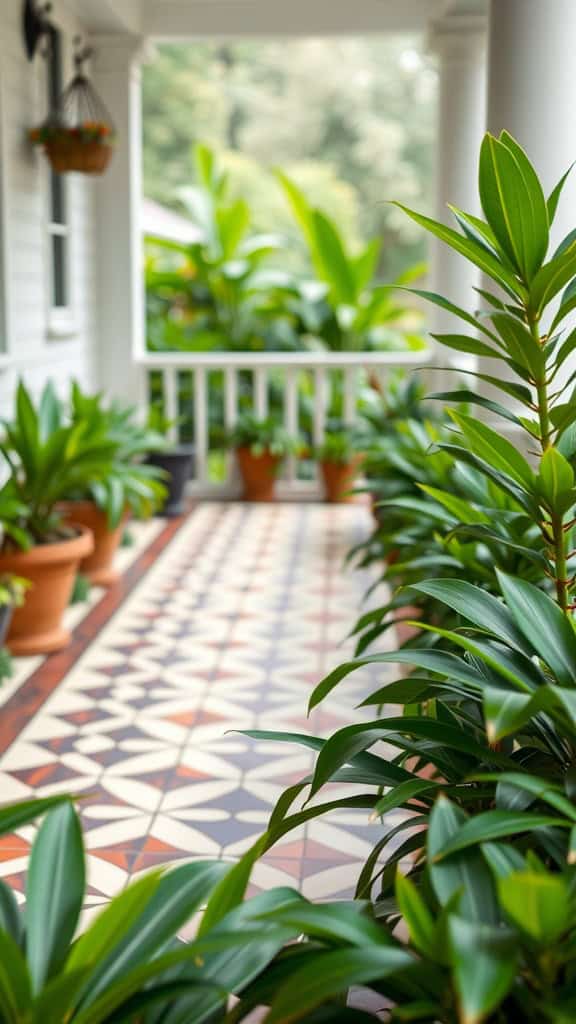
Basketweave for Vintage Grace
If you’re a fan of intricate patterns but still want something timeless, basketweave might just be your best friend. It instantly reminds me of vintage porches and garden spaces, where every detail feels thoughtful. This pattern has a way of adding texture and charm without feeling dated or overwhelming.
The tiny rectangles weaving together are so eye-catching without screaming for attention. It’s subtle yet decorative, which makes it a great option if you’re going for a porch that blends well with multiple decor styles. Whether you lean toward rustic farmhouse vibes or classic elegance, basketweave tiles deliver.
You can find basketweave tiles in all sorts of finishes and colors, from simple white and gray to more dramatic combos like terracotta with black accents. I personally love using it in a neutral palette because it lets you play with other elements like furniture or plants to liven up the space. Plus, the smaller details in the pattern give the illusion of a more textured surface, which makes the whole porch feel cozier.
One thing to keep in mind: with all those little spaces between tiles, grout color can totally transform the look of basketweave patterns. A grout that matches the tile will make the design more subtle, while a contrasting grout highlights the pattern and gives it a crisp, defined look. It’s all about the finishing touch!
So there you have it—three gorgeous patterns that stand the test of time. Each has its own charm and personality, but they all offer that perfect balance of style and simplicity that’s key for any welcoming porch.
Best Patterns for Narrow or Small Porches
Sometimes it feels like designing a small or narrow porch is solving a puzzle where the pieces just don’t want to cooperate. Been there? You want the space to feel charming, welcoming, and, most importantly, bigger than it actually is. That’s where the magic of porch tile patterns comes in! Certain layouts can trick the eye, creating illusions of space and openness without changing the actual dimensions of your porch. It’s like giving your porch a makeover—no renovation required! Below I’ll share two of my favorite tile patterns that work wonders for small or narrow spaces. Trust me, these are simple solutions that bring big results.
Diagonal Tiles: Creating Broader Dimensions
Have you ever tried angling furniture in a room to make it look bigger? The same idea works with tile, and diagonal patterns are basically the MVP here! Laying tiles diagonally creates depth and movement that pull your eyes outward, making the space feel wider. It’s like when you look at a well-manicured garden path—it seems to stretch further than it actually does. Just perfect for small porches that need a little visual breathing room.
This pattern works especially well with square tiles in subtle tones like soft gray, cream, or light terracotta. The angled lines “break up” the square footprint of the porch and keep it from feeling boxy or closed in. I also love how diagonal tiles naturally flow without creating abrupt edges, which is great when you have a smaller porch area. It makes everything feel a little more cohesive and relaxed. Plus, if you pair it with furniture that mirrors the angle—maybe a cute bistro set turned slightly askew—you maximize the effect even more. Quick tip: stick with a grout color that closely matches your tiles. This keeps the pattern smooth and avoids chopping up the look with busy grid lines.
And for the moms out there trying to keep their porch kid-proof (hands raised here!), diagonal tiles hide dirt and imperfections like a charm. Whether it’s muddy footprints after a soccer game or snack crumbs from an outdoor picnic, everything blends just a little better with a diagonal layout.
Linear Patterns: Streamlined Simplicity
For narrow porches, linear tile patterns are a total game-changer. These layouts guide the eye along the length of the space, giving a streamlined effect that makes it feel roomier. Think of stripes in fashion—horizontal lines can make something appear wider, while vertical ones create height. The same rule applies here, but with tiles! If your porch feels cramped, this is such a reliable trick.
You can achieve this look by choosing rectangular tiles, such as planks or subway-style tiles, and laying them in rows that run lengthwise along your porch. I swear, it’s like the porch “stretches out” right before your eyes! It’s also such a clean, contemporary style that works beautifully whether your home leans rustic or modern. My personal favorite is using wood-look tile in a soft oak or weathered finish. It gives off the cozy vibes of a traditional wooden porch but with way less maintenance…yes, please!
Feeling adventurous? Try alternating light and dark tiles in a linear pattern for just a hint of contrast. The trick here is keeping the colors within the same tonal family—for example, soft gray and white or beige and cream. This adds a little personality without making things feel too “busy.” And don’t worry about it clashing with furniture or decor! Linear patterns are like that perfect pair of neutral shoes—they go with everything.
So if your narrow porch has felt more like a hallway, linear tiles are your new best friend. They open up the space visually, while still giving you plenty of room for things like a comfy bench or a couple of planters. And let’s be real…more space for cute plants is always a win!
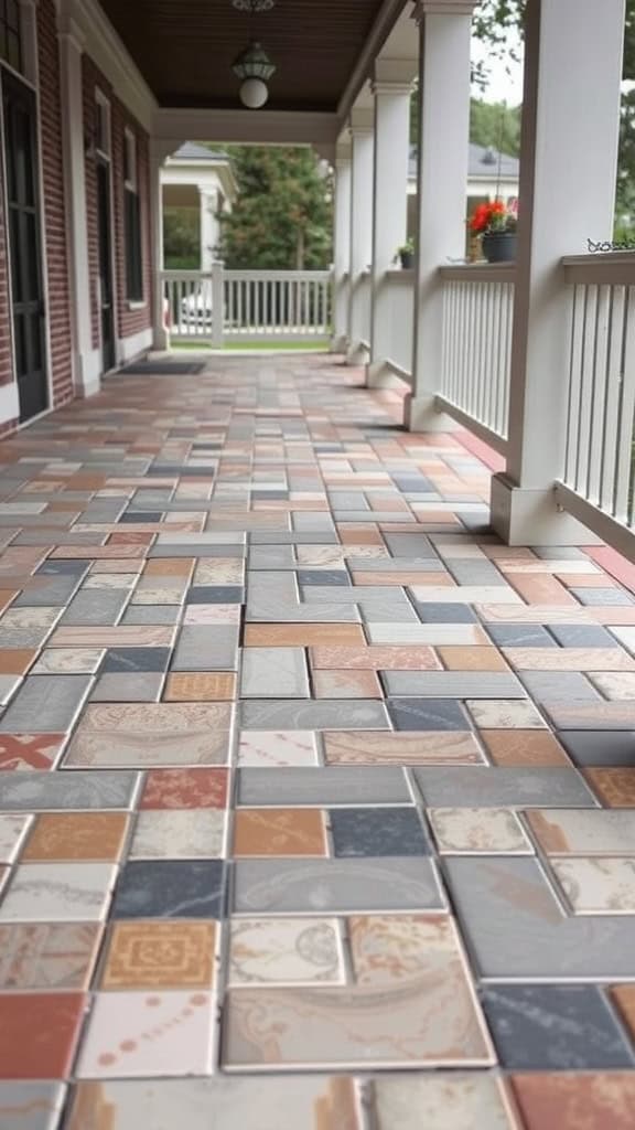
Mixing and Matching Porch Tile Patterns Effectively

When it comes to designing a porch that feels warm and inviting without going over the top, mixing and matching tile patterns is one of my go-to tricks. Using a variety of styles and textures adds personality to the space, but the key is finding that perfect balance so it doesn’t feel chaotic. Trust me, I’ve experimented plenty—sometimes with kids running around in the middle of “mom’s decorating moment”—and I’ve realized that a little strategy goes a long way when combining tiles. Whether you’re looking to make your porch more polished or just want to get creative, here are two methods I swear by.
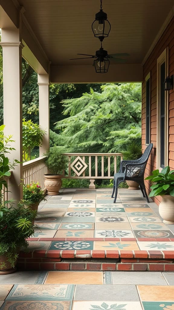
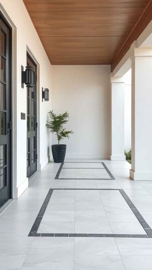
Using Borders or Insets for Structure
If there’s one thing I’ve learned about porch design, it’s how much borders and insets can totally change the feel of the space. Think of them as the picture frame for your porch floor—they help “define” areas without making it look fussy. This is especially handy if your porch doubles as a hangout spot for kids and a cozy escape for you. It creates a sense of order, which is a lifesaver when the rest of life feels messy.
One easy way to do this is by adding a border of solid tiles around your porch, framing a busier pattern in the middle. The solid tiles act like a calming buffer, letting the patterned area shine without overwhelming the whole space. For example, you could try something like floral or geometric tiles in the center, offset by a simple border in a coordinating neutral. It’s kind of like wearing a patterned blouse and pairing it with solid jeans—it just works.
Another fun idea is creating insets to “section off” specific areas, especially if your porch serves multiple functions. Maybe a small inset around the seating area with intricate mosaic tiles, while the rest of the porch stays simple with solid tones. It helps ground the seating space and makes everything feel more intentional. Plus, it’s such a stunning way to add depth to the design without feeling busy.
I love how borders can also give your porch instant structure if the layout feels awkward. When we revamped our narrow front porch, a clean border in a darker tile helped anchor the space and made it feel more cohesive. Suddenly the porch felt cozy and not just like a long, skinny walkway—you know what I mean?
Combining Patterns and Solid Tiles

Mixing patterned tiles with solid ones is honestly my secret weapon for creating balance. It’s like when you let your kids pick their clothes but gently guide them to choose one crazy piece at a time instead of all the sparkles and stripes at once. The same rule applies to tiles!
A great way to pull this off is by using patterned tiles as a statement piece while keeping most of the porch floor simple and solid. For example, try laying a patterned tile in the center of the porch and surrounding it with a complementary solid. It’s simple, eye-catching, and doesn’t feel overwhelming. I always think of this as the “accent wall” concept for floors—it’s just enough personality to make the space your own without over-decorating.
Another option is alternating patterned and solid tiles in a checkerboard style or even something more linear. For a softer, timeless look, stick with subtle patterns like small-scale florals or muted geometric designs paired with solid tiles in a matching color palette. This kind of mix feels playful yet understated, which is perfect if you want a porch that will age gracefully with your home.
If you’re feeling a little bolder, try contrasting tones between your solid and patterned tiles. For instance, pair colorful encaustic tiles with crisp white or black solids for a striking look. It’s a little more daring but still keeps things structured—like cooking with spice…just enough to make it exciting without overwhelming the dish.
Practical tip: if you do go this route, pay attention to your furniture and decor. Keeping outdoor seating and accessories on the neutral side lets the design shine, while mixing too many patterns can make it feel chaotic. I’ll even test this out by putting random decor around the tile samples first, just to see how all the elements play together. Trust me, this step saves you headaches down the road!
Choosing Materials and Colors That Work With Patterns
When you’re designing a porch, picking the perfect tile pattern is just half the battle. You’ve got to think about the materials and colors that will actually bring that design to life. Trust me, I’ve learned through trial and error (and a few too many Pinterest fails) that these decisions make all the difference. The right materials can handle everything life throws at them—like spilled drinks or your kids’ favorite outdoor toys—and the perfect color palette ties everything together beautifully without overwhelming the space. Let’s break it down so you can make choices that feel just right for your porch.
Material Considerations for Durability
Here’s the thing about porches: they take a beating. Between family hangouts, weather changes, and an army of toy cars zooming around, the materials you choose have to hold up. That’s why I always recommend going with something tough, like porcelain or stone tiles. They’re basically the superheroes of porch flooring because they can handle anything and still look amazing.
Porcelain tiles are my personal favorite for outdoor spaces. Why? They’re incredibly durable, super low-maintenance, and don’t absorb moisture the way some materials do. That means no worrying about spills from juice boxes or those surprise summer rain showers. Plus, there are so many design options with porcelain—it can mimic everything from natural stone to wood. It’s like getting the best of both worlds: beauty and functionality.
If you’re into a natural, earthy vibe, stone tiles are another fantastic choice. Slate and travertine, for example, bring so much texture and character to a porch. They’re sturdy, timeless, and perfect for creating that cozy, organic feel. Just keep in mind that stone might need a little extra love when it comes to sealing and maintenance. It’s a small trade-off for those gorgeous, natural textures though!
Another tip? Don’t forget about slip resistance, especially if you’ve got little ones running around or if you live in a rainy area. Look for tiles with a textured, matte surface to make sure everyone stays safe while still keeping things stylish. Safety first, but make it cute, right?
Selecting Colors That Won’t Overwhelm
Let’s talk color palettes…because this is where things can easily go from charming to chaotic if you’re not careful. The key is striking a balance. You want the pattern to pop, but not in a way that makes your porch feel like it’s shouting at you every time you walk up. Trust me, I’ve made the mistake of going too bold, and let’s just say it wasn’t as fun to look at as I thought it’d be.
Subtle shades are your best friend when working with patterned tiles. Think soft grays, whites, or earthy tones like taupe, sand, or muted terracotta. These colors keep the overall vibe of your porch warm and inviting while giving the pattern room to shine. It’s like when you accessorize an outfit—sometimes less is more. Let the pattern itself be the statement piece, and everything else can play a supporting role.
If you’re the kind of person who loves a little pop of color (raises hand), you can absolutely make that work too! Just try to limit it to one or two accent colors that complement the rest of the space. For example, a soft sage green or a gentle blue can look stunning in a tile pattern without feeling overwhelming. Pair those colors with neutral furniture or planters, and suddenly your porch feels lively and cohesive. It’s all about balance.
One little tip I swear by: always take a moment to step back and look at your choices as a whole. Bring tile samples outdoors, see how they look in natural light, and hold them up next to your existing porch furniture or decor. Sometimes the colors that look gorgeous in a store (with their perfect lighting!) can feel totally off when you see them at home. And let’s face it, chasing kids around the tile aisle isn’t exactly the easiest way to picture a finished porch, so taking those samples home really helps.
Finally, consider how your tile color plays with grout. Grout color might seem like an afterthought, but it’s a big deal for patterned tiles. A grout that matches the tile can make the design feel soft and subtle, while a contrasting grout makes the pattern pop in a bold way. Personally, I’m a fan of subtle contrast—it keeps things interesting without going overboard.
By focusing on durable materials and picking colors that enhance (not compete with) your tile patterns, you’ll create a porch that feels both polished and inviting. And the best part? It’ll hold up to toy trucks, muddy boots, and endless family gatherings like a pro!
Conclusion
Choosing the right porch tile patterns can be such a simple way to give your home a fresh, welcoming feel without overcomplicating the space…even with little ones running wild! Whether you love timeless designs like herringbone or want to experiment with playful patterns like checkerboard, there’s a look out there that fits your personality and lifestyle.
You don’t have to sacrifice practicality for beauty. With the right materials, colors, and patterns, your porch can handle family life while still feeling like your perfect retreat. It’s all about finding what works for your style and making it a space you’re proud of—and maybe even excited to show off during those busy playdates or quiet coffee mornings.
Remember, a little thought goes a long way. Take it one step at a time, have fun with the process, and before you know it, you’ll have a porch that feels just as charming, functional, and unique as you are!
This post may contain affiliate links. Read the full disclosure here.